Role
Brand Director
Duration
05/2024 - 09/2024
Tools
Figma, Illustrator, Photoshop
Services
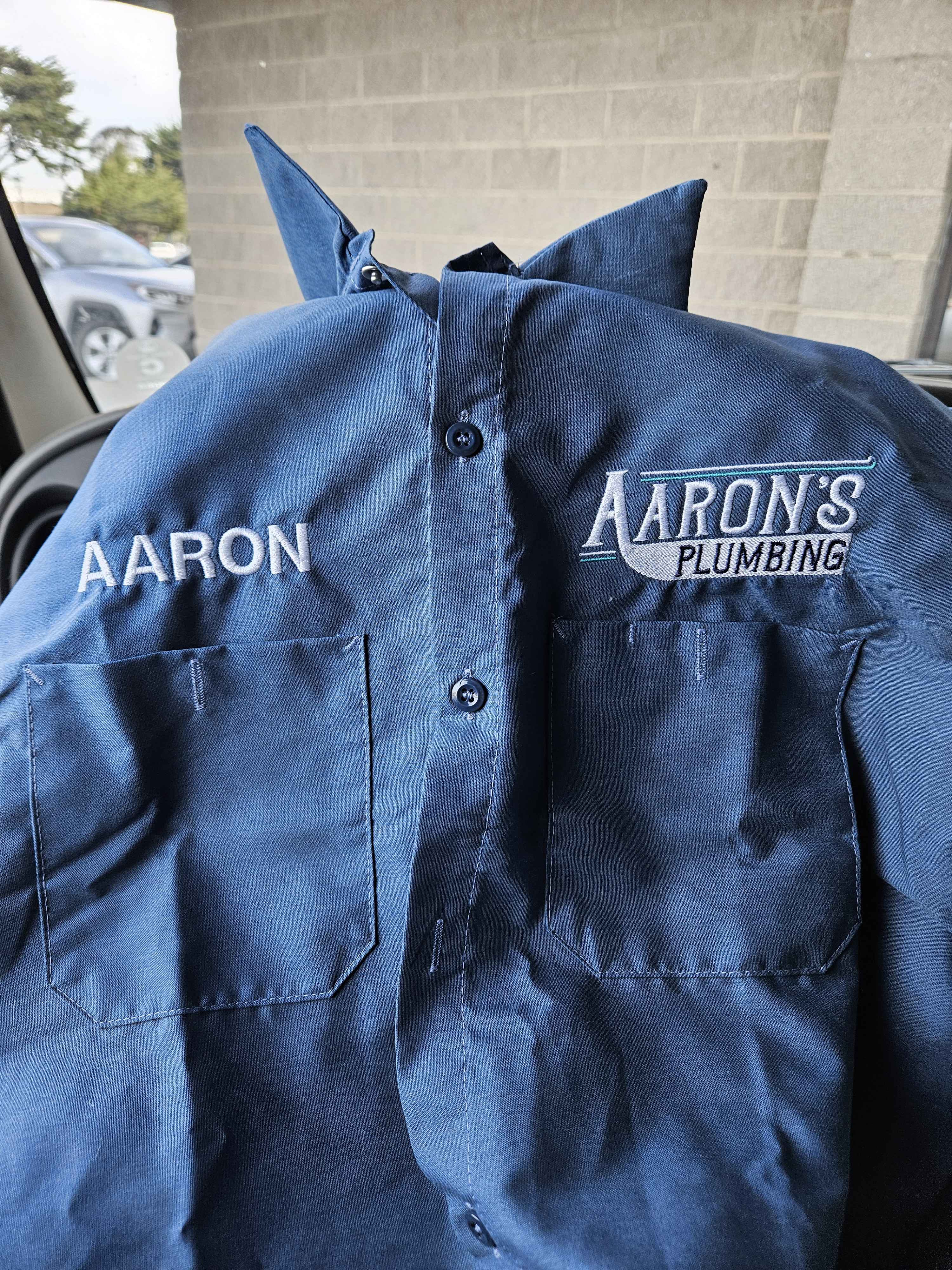
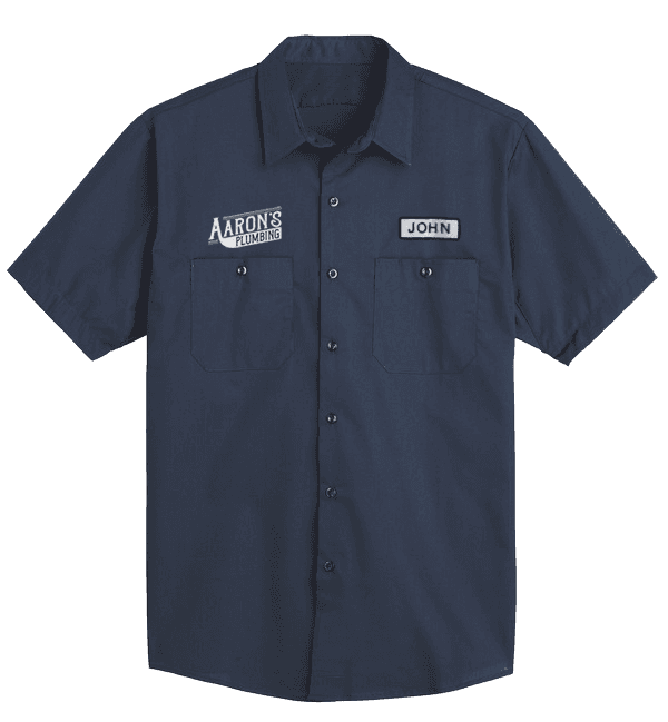
Creative Direction ⋅ Visual Identity Design ⋅ Logo Design ⋅ Signage ⋅ Van decals ⋅ Apparel ⋅ Print Design
Overview
A local business operating in the Monterey County, Aaron’s Plumbing specializes in residential plumbing, mainly serving homeowners and small businesses. The founder, Aaron Lindvall, reached out to me, seeking to stand out from the rest of the crowd, and I brought his vision to fruition.
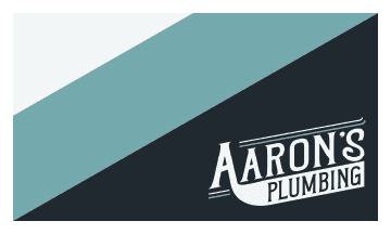
The logomark presents a strong, vintage look—utilizing subtle shapes and curves to resemble pipes, and evoke integrity, trustworthiness, and tradition.
Why Aaron's Plumbing?
Aaron has been a contracted plumber working at a certain company for a number of years. Over time, he needed more fruitful opportunities. However, there’s not much better options out there in the Monterey County — there’s mistrust between customers, malpractice, so on and so forth.
So what if he learned the ropes to starting his own plumbing business?
Background
To be honest, I didn't know a thing about plumbing. So I started with the basics, such as:
Mission statement and core values.
Essential brand message, personality, and tone
Other products or services
Here's a snippet from one response:
"I sort of cringe when I see some construction vehicles with flashy logos, and tons of in-your-face advertising of services and products. While some of them are well intentioned, that type of advertising makes me think of specific local companies that try to upsell clients on unnecessary things or quote prices that are deceptive."
Initial Concepts
"I would describe [Aaron's Plumbing] as vintage and nostalgic. I want clients to see the font, color, and line work and think of what they would describe as “better times” […] I want people to be able to see my signage and be reminded of warm, happier, traditional times."
The following designs takes inspiration from vintage baseball jersey logos. The Vintage Rough typeface was used to elicit nostalgic emotions, while still being minimal, forward thinking, and of course legible.


A simplistic design with a readable layout.
The vision behind stylizing the ‘A’ and connecting it with ‘PLUMBING’ is to resemble a plumbing pipe. I’ve also added two additional lines acting as pipe-like elements above the company name


Less straight, more curves.
Contrasts the first concept through more curves, hand-drawn aesthetic, and additional decorations to amp up the main titles. I designed it to be more vintage-looking than the first using these elements, while still being careful not to overdo it.
"I have been thinking about the logos, and showed them to some people and they all like the first logo example (minimal) you showed me. What do you think?"
Final Design
Expanding
Not too little, not too much


Other Brand Assets